
 The Lethbridge Hurricanes revealed a snazzy new look Monday afternoon.
The Canes' unveiled a red third jersey at the 18th Air Defence Regiment. The team will wear the new jersey for the first time on Wednesday in conjunction with a salute to the Canadian Armed Forces.
This new jersey is a complete redesign that includes a return to one of the team's original colours, which is cardinal red. The look is very similar to that of the NHL's Washington Capitals. It sports a redesigned logo and a "CANES" logo patch on the shoulders. On the back, white numbers and names, outlined in black.
Hurricanes Media Relations Officer Ryan Ohashi says the organization is thrilled to be unveiling the new jersey, which at the same time shows support for the Canadian Forces. He says the return to a red jersey is something the Hurricanes have been developing for quite some time and felt rolling out the new look just before Remembrance Day was perfect timing. I spoke with Hurricanes Defenceman Cason Machacek about the new jersey. The Lethbridge native told me, "I think the fans are really going to like this new logo and jersey. It's got a little bit of history with the stars and such. I think it's a pretty cool logo."
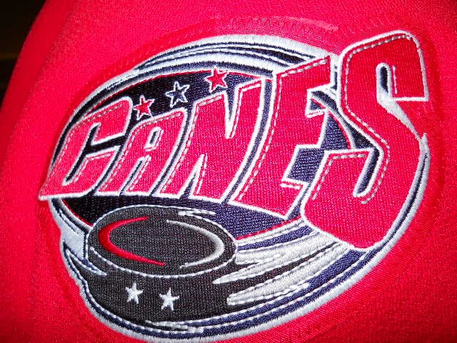
Personally, I love the new look and I think the fans will too. It's very sharp and the brighter red colour certainly stands out a lot more than the current crimson red that's been used the past number of years. I really like the logo too. It's got more appeal than the current one in my opinion. I know the Hurricanes have had a number of logo changes over the years, but I think they should really consider using this new look permanently. I think this logo would look pretty sharp on a white jersey too. The shoulder patches (shown here on the right) are a nice addition as well. They go back a few years to the Hurricanes logo with hurricane swirl and the puck, but just using the word "Canes" instead. Nice look!
 years. I really like the logo too. It's got more appeal than the current one in my opinion. I know the Hurricanes have had a number of logo changes over the years, but I think they should really consider using this new look permanently. I think this logo would look pretty sharp on a white jersey too. The shoulder patches (shown here on the right) are a nice addition as well. They go back a few years to the Hurricanes logo with hurricane swirl and the puck, but just using the word "Canes" instead. Nice look!
 Thanks,
Pat
This blog post is brought to you by http://www.clearlylethbridge.com/.
These look good but could they not have come up with something that was unique to the Hurricanes and not a blatant rip-off of the Washington Capitals?
ReplyDelete-cc
It is a nice look but we are not the Washington Capitals! It would have been mice to come up with something more unique to us and our team! Other WHL teams use similar styles of jerseys such as numbers and lettering but seem to have original logo. I think this is where we took a wrong turn. It probably will not stop me from purchasing one though.
ReplyDeleteRuss
You do know our jerseys come from the Billings Bighorns originally? they were a copy of the Caps with a different logo. It's a tip of the cap to the team's history. You'd rather we returned to the goofy Twister logo? A giant gopher with horns?
ReplyDelete-- Dylan
as long as we do not do anything like the blades new jersey. i thought we were hicks in lethbridge but saskatchewan you have proven me wrong by a mile. Your reputation of being red neck cousin kissin bumpkins has been confirmed. if you don't know what i'm talking about search it. it's going to take the blades longer to rebuild their reputation than any of us will live. their new jerseys have set mankind back to pre slavery times. i just hope this is not a trend to make "so bad they are good" marketing. blades you now have cemented yourselves as the biggest joke in sports. great job. just make sure to wear some grape smuggler wranglers while you play in these jerseys. it's the only way to make the team look like more of a joke.
ReplyDeleteNice look, but as a couple of other comments have stated, it is too much like the Washington Captials. The Lethbridge Hurricanes need something that is unique, stands out in the crowd. All we do is copy NHL teams....Carolina and now Washington. Can't they find something that works with name that is orginal?
ReplyDeleteRJS
RJS you might want to check your history of the Carolina Hurricanes and Lethbridge Hurricanes, and see which team was founded first. A prime example of the comments of some people on here who have very little hockey knowlage but talk like they are experts
ReplyDeleteths canes are never that creative look a few seasons ago when they came out with the carolina jersey and had to quit using it...might be nice if they ever stepped out of the box
ReplyDeleteI don't see any similarities between this jersey and the Capitals jersey.
ReplyDeleteGDC
For everyone that whines about originality and copying an NHL team, here are some other CHL teams that model their jerseys after NHL teams.
ReplyDeleteBoston Bruins- Chilliwack, Kingston
Calgary Flames- Baie Comeau
New York Rangers- Kitchener
LA kings- (previously) Hull
Chicago Blackhawks- Portland
I find it funny how people keep coming up with ways on how NOT to support the team but very few people come up with ways how to support the team
ReplyDeleteI was fully aware of the Lethbridge Hurricanes(1987 to present) having been around long before the Carolina Hurricanes (1997 to the present). I was referring to the use of a logo that looked very much like that of Carolina's. Records show that the Lethbridge Hurricanes used the Taz Logo from the 1997/98 season to the 2003/04 season, then adopted a version of the Carolina Swirl and used it from 2004/05 until 2008/09.
ReplyDeleteSo much for the lack of expertise.
RJS